Article 16 brought to the operations panel the silverpoint components that take a value and the ones that show data. This one goes on with the rest: the table, the composed components and the overlays, the ones that open on top of the page.
What you will build
A table with the day's incidents. It sorts by service, severity, time or duration, and shows five rows per page. A button opens a modal to acknowledge an open incident, and once it is acknowledged a notification confirms it.
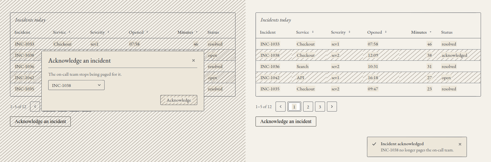
On the left, the modal open over the table sorted by minutes, from most to fewest. On the right, the same table with INC-1038 acknowledged and the notification below.
The table
SpTable draws a native table: <table>, <caption>, <th scope="col">. Each column is a row with key and title, and can carry align, sortable and width. Each cell shows the value of its field as text; there are no custom cells.
| Prop | What it does |
|---|---|
columns | The columns, in order |
data | The rows that are drawn |
caption | The table's title, which also names it |
sortKey, sortOrder | The sorted column and its direction, asc or desc |
onSort | Called with the key of the column whose header is pressed |
striped, hoverable, bordered | Alternate hatched rows, heightening under the pointer, borders |
emptyText | The text with no rows; by default, "No data" |
rowKey | The field that identifies each row |
The table does not sort: it tells you. The header of a column with sortable is a button, and pressing it gives onSort the key. You sort, with uiSortRows from @silverpoint/core/ui (in Reflex, sort_rows), and pass the table the sorted rows with sortKey and sortOrder so it draws the arrow and puts aria-sort on that column.
uiSortRows is stable, puts numbers before text, compares text in lower case without regard to language, and leaves rows with no value at the end. Since the order is yours, you can also sort on the server or with your own function.
The data
Twelve incidents of the day, in src/incidents.ts. In Vue it is the same file, and in Angular it goes in src/app/incidents.ts:
export type Incident = {
  id: string;
  service: string;
  severity: string;
  opened: string;
  minutes: number;
  status: string;
};

export const INCIDENTS: Incident[] = [
  { id: 'INC-1031', service: 'API', severity: 'sev2', opened: '00:42', minutes: 18, status: 'resolved' },
  { id: 'INC-1032', service: 'Search', severity: 'sev3', opened: '02:15', minutes: 7, status: 'resolved' },
  { id: 'INC-1033', service: 'Checkout', severity: 'sev1', opened: '07:58', minutes: 46, status: 'resolved' },
  { id: 'INC-1034', service: 'API', severity: 'sev3', opened: '08:20', minutes: 5, status: 'resolved' },
  { id: 'INC-1035', service: 'Checkout', severity: 'sev2', opened: '09:47', minutes: 23, status: 'resolved' },
  { id: 'INC-1036', service: 'Search', severity: 'sev2', opened: '10:31', minutes: 31, status: 'resolved' },
  { id: 'INC-1037', service: 'API', severity: 'sev1', opened: '11:56', minutes: 12, status: 'resolved' },
  { id: 'INC-1038', service: 'Checkout', severity: 'sev2', opened: '12:09', minutes: 38, status: 'open' },
  { id: 'INC-1039', service: 'Search', severity: 'sev3', opened: '13:44', minutes: 9, status: 'open' },
  { id: 'INC-1040', service: 'API', severity: 'sev2', opened: '14:02', minutes: 16, status: 'open' },
  { id: 'INC-1041', service: 'Checkout', severity: 'sev3', opened: '15:30', minutes: 4, status: 'open' },
  { id: 'INC-1042', service: 'API', severity: 'sev1', opened: '16:18', minutes: 27, status: 'open' },
];

export const COLUMNS = [
  { key: 'id', title: 'Incident' },
  { key: 'service', title: 'Service', sortable: true },
  { key: 'severity', title: 'Severity', sortable: true },
  { key: 'opened', title: 'Opened', sortable: true },
  { key: 'minutes', title: 'Minutes', sortable: true, align: 'end' as const },
  { key: 'status', title: 'Status' },
];

export const PAGE_SIZE = 5;
align: 'end' as const keeps the literal so the type fits the columns' type.
Pagination
SpPagination does not slice the rows: it draws the page buttons and reports the change. You give it the total (total) and the page size (pageSize, 10 by default), and you slice the rows of the current page. With showTotal it writes the range, "6–10 of 12"; totalTemplate changes that text.
| Controlled | Change | |
|---|---|---|
| React | current | onChange(page) |
| Vue | v-model:current | update:current |
| Angular | [(current)] | (currentChange) |
| Reflex | current | on_change |
The overlays
| Component | What for | How it works |
|---|---|---|
SpModal | A dialog that blocks the page | A <dialog> opened with showModal() |
SpDrawer | A dialog against one side (side) | A <dialog>, modal unless modal={false} |
SpPopover | Content next to its trigger, without blocking | A popover from the Popover API |
SpTooltip | A short text on hover or focus | A manual popover, which does not close the others |
SpSelect | One option from a list | A select-only combobox |
SpDropdownMenu | A menu of actions | onSelect receives the action's key |
SpToast | A message that closes by itself | An item in the list of SpToaster |
They all use the platform: the browser puts the overlay on top of the page, traps the modal's focus and closes it with Escape.
The trigger is a native button
Each overlay opens with a native <button type="button">, which receives its ARIA (aria-haspopup, aria-expanded, aria-controls) and its toggle:
| Framework | Where it goes |
|---|---|
| React | The trigger prop, trigger={<button type="button">…</button>} |
| Vue | The #trigger slot |
| Angular | A projected <button type="button" spTrigger>; SpTrigger is imported from the overlay's subpath |
| Reflex | trigger="…", a string drawn as a button, or trigger=rx.el.button(…, type="button") |
In React, do not pass an SpButton as the trigger: it drops the ARIA it is given.
Open state
| Controlled | Uncontrolled | Change | |
|---|---|---|---|
| React | open | defaultOpen | onOpenChange(open) |
| Vue | v-model:open | default-open | update:open |
| Angular | [(open)] | [defaultOpen] | (openChange) |
| Reflex | open | default_open | on_open_change |
onOpenChange is also called when the platform closes the overlay: with Escape or with a click outside. A modal with dismissible={false} ignores both.
Notifications
Put one SpToaster near the root and, inside it, one SpToast per message. A message closes after 5000 ms, the container's duration, unless it has its own. While it has the pointer or the focus, the count stops, and F8 moves focus to the container.
The incidents table in React
import { useState } from 'react';
import { uiSortRows } from '@silverpoint/core/ui';
import { SpButton } from '@silverpoint/react/ui/button';
import { SpModal } from '@silverpoint/react/ui/modal';
import { SpPagination } from '@silverpoint/react/ui/pagination';
import { SpSelect } from '@silverpoint/react/ui/select';
import { SpTable } from '@silverpoint/react/ui/table';
import { SpToast, SpToaster } from '@silverpoint/react/ui/toast';
import { COLUMNS, INCIDENTS, PAGE_SIZE } from './incidents';

export function Incidents() {
  const [rows, setRows] = useState(INCIDENTS);
  const [sortKey, setSortKey] = useState('opened');
  const [sortOrder, setSortOrder] = useState<'asc' | 'desc'>('desc');
  const [page, setPage] = useState(1);
  const [open, setOpen] = useState(false);
  const [picked, setPicked] = useState<string | null>(null);
  const [acknowledged, setAcknowledged] = useState('');
  const [toastOpen, setToastOpen] = useState(false);

  const visible = uiSortRows(rows, sortKey, sortOrder).slice((page - 1) * PAGE_SIZE, page * PAGE_SIZE);
  const openIds = rows.filter((row) => row.status === 'open').map((row) => row.id);

  function sort(key: string) {
    setSortOrder(key === sortKey && sortOrder === 'asc' ? 'desc' : 'asc');
    setSortKey(key);
    setPage(1);
  }

  function acknowledge() {
    setRows(rows.map((row) => (row.id === picked ? { ...row, status: 'acknowledged' } : row)));
    setAcknowledged(picked ?? '');
    setPicked(null);
    setOpen(false);
    setToastOpen(true);
  }

  return (
    <section>
      <SpTable
        caption="Incidents today"
        columns={COLUMNS}
        data={visible}
        rowKey="id"
        sortKey={sortKey}
        sortOrder={sortOrder}
        onSort={sort}
        striped
      />
      <SpPagination total={rows.length} pageSize={PAGE_SIZE} current={page} onChange={setPage} showTotal />
      <SpModal
        title="Acknowledge an incident"
        description="The on-call team stops being paged for it."
        trigger={<button type="button">Acknowledge an incident</button>}
        open={open}
        onOpenChange={setOpen}
        footer={
          <SpButton variant="primary" disabled={!picked} onClick={acknowledge}>
            Acknowledge
          </SpButton>
        }
      >
        <SpSelect
          label="Incident"
          placeholder="Choose an open incident"
          items={openIds}
          value={picked}
          onChange={setPicked}
        />
      </SpModal>
      <SpToaster>
        <SpToast
          kind="success"
          title="Incident acknowledged"
          description={`${acknowledged} no longer pages the on-call team.`}
          open={toastOpen}
          onOpenChange={setToastOpen}
        />
      </SpToaster>
    </section>
  );
}
The order starts with the opening time, from the most recent to the oldest. Pressing a column sorts it from lowest to highest, and pressing it again, the other way round; each change goes back to the first page. setPage, setOpen, setPicked and setToastOpen are passed as they are, because the handlers receive the value.
The Acknowledge button is disabled until an incident is chosen. Once it is acknowledged, the row changes to acknowledged, the modal closes and the notification opens.
In src/index.css, one rule for the trigger:
button[aria-haspopup='dialog'] {
  padding: 6px 14px;
  border: 1px solid #3b3a36;
  border-radius: 2px;
  background: transparent;
  font: inherit;
  cursor: pointer;
}
It draws the trigger, which is a native button and comes out unstyled. The table needs no rule: since 0.10.0, the cells of SpTable align to the start. Up to 0.9.2 they were aligned to the right by the .sp-table td rule in styles.css, the one for the charts' data tables (silverpoint#12).
The incidents table in Vue
<script setup lang="ts">
import { computed, ref } from 'vue';
import { uiSortRows } from '@silverpoint/core/ui';
import { SpButton } from '@silverpoint/vue/ui/button';
import { SpModal } from '@silverpoint/vue/ui/modal';
import { SpPagination } from '@silverpoint/vue/ui/pagination';
import { SpSelect } from '@silverpoint/vue/ui/select';
import { SpTable } from '@silverpoint/vue/ui/table';
import { SpToast, SpToaster } from '@silverpoint/vue/ui/toast';
import { COLUMNS, INCIDENTS, PAGE_SIZE } from '../incidents';

const rows = ref(INCIDENTS);
const sortKey = ref('opened');
const sortOrder = ref<'asc' | 'desc'>('desc');
const page = ref(1);
const open = ref(false);
const picked = ref<string | null>(null);
const acknowledged = ref('');
const toastOpen = ref(false);

const visible = computed(() =>
  uiSortRows(rows.value, sortKey.value, sortOrder.value).slice((page.value - 1) * PAGE_SIZE, page.value * PAGE_SIZE),
);
const openIds = computed(() => rows.value.filter((row) => row.status === 'open').map((row) => row.id));

function sort(key: string) {
  sortOrder.value = key === sortKey.value && sortOrder.value === 'asc' ? 'desc' : 'asc';
  sortKey.value = key;
  page.value = 1;
}

function acknowledge() {
  rows.value = rows.value.map((row) => (row.id === picked.value ? { ...row, status: 'acknowledged' } : row));
  acknowledged.value = picked.value ?? '';
  picked.value = null;
  open.value = false;
  toastOpen.value = true;
}
</script>

<template>
  <section>
    <SpTable
      caption="Incidents today"
      :columns="COLUMNS"
      :data="visible"
      row-key="id"
      :sort-key="sortKey"
      :sort-order="sortOrder"
      striped
      @sort="sort"
    />
    <SpPagination v-model:current="page" :total="rows.length" :page-size="PAGE_SIZE" show-total />
    <SpModal
      v-model:open="open"
      title="Acknowledge an incident"
      description="The on-call team stops being paged for it."
    >
      <template #trigger><button type="button">Acknowledge an incident</button></template>
      <SpSelect v-model="picked" label="Incident" placeholder="Choose an open incident" :items="openIds" />
      <template #footer>
        <SpButton variant="primary" :disabled="!picked" @click="acknowledge">Acknowledge</SpButton>
      </template>
    </SpModal>
    <SpToaster>
      <SpToast
        v-model:open="toastOpen"
        kind="success"
        title="Incident acknowledged"
        :description="`${acknowledged} no longer pages the on-call team.`"
      />
    </SpToaster>
  </section>
</template>v-model:current, v-model:open and v-model do the work of the React pairs. The header emits sort, and the trigger and the footer go in the #trigger and #footer slots.
The incidents table in Angular
import { Component, computed, signal } from '@angular/core';
import { uiSortRows } from '@silverpoint/core/ui';
import { SpButton } from '@silverpoint/angular/ui/button';
import { SpCardFooter, SpModal, SpTrigger } from '@silverpoint/angular/ui/modal';
import { SpPagination } from '@silverpoint/angular/ui/pagination';
import { SpSelect } from '@silverpoint/angular/ui/select';
import { SpTable } from '@silverpoint/angular/ui/table';
import { SpToast, SpToaster } from '@silverpoint/angular/ui/toast';
import { COLUMNS, INCIDENTS, PAGE_SIZE } from './incidents';

@Component({
  selector: 'app-incidents-table',
  imports: [SpButton, SpCardFooter, SpModal, SpPagination, SpSelect, SpTable, SpToast, SpToaster, SpTrigger],
  template: `
    <section>
      <sp-table
        caption="Incidents today"
        [columns]="columns"
        [data]="visible()"
        rowKey="id"
        [sortKey]="sortKey()"
        [sortOrder]="sortOrder()"
        striped
        (sort)="sort($event)"
      />
      <sp-pagination [(current)]="page" [total]="rows().length" [pageSize]="pageSize" showTotal />
      <sp-modal
        [(open)]="open"
        title="Acknowledge an incident"
        description="The on-call team stops being paged for it."
      >
        <button type="button" spTrigger>Acknowledge an incident</button>
        <sp-select [(value)]="picked" label="Incident" placeholder="Choose an open incident" [items]="openIds()" />
        <ng-template spFooter>
          <button type="button" spButton variant="primary" [disabled]="!picked()" (click)="acknowledge()">
            Acknowledge
          </button>
        </ng-template>
      </sp-modal>
      <sp-toaster>
        <sp-toast
          [(open)]="toastOpen"
          kind="success"
          title="Incident acknowledged"
          [description]="acknowledged() + ' no longer pages the on-call team.'"
        />
      </sp-toaster>
    </section>
  `,
})
export class IncidentsTable {
  protected readonly columns = COLUMNS;
  protected readonly pageSize = PAGE_SIZE;
  protected readonly rows = signal(INCIDENTS);
  protected readonly sortKey = signal('opened');
  protected readonly sortOrder = signal<'asc' | 'desc'>('desc');
  protected readonly page = signal(1);
  protected readonly open = signal(false);
  protected readonly picked = signal<string | null>(null);
  protected readonly acknowledged = signal('');
  protected readonly toastOpen = signal(false);

  protected readonly visible = computed(() =>
    uiSortRows(this.rows(), this.sortKey(), this.sortOrder()).slice(
      (this.page() - 1) * PAGE_SIZE,
      this.page() * PAGE_SIZE,
    ),
  );
  protected readonly openIds = computed(() => this.rows().filter((row) => row.status === 'open').map((row) => row.id));

  protected sort(key: string) {
    this.sortOrder.set(key === this.sortKey() && this.sortOrder() === 'asc' ? 'desc' : 'asc');
    this.sortKey.set(key);
    this.page.set(1);
  }

  protected acknowledge() {
    const picked = this.picked();
    this.rows.update((rows) => rows.map((row) => (row.id === picked ? { ...row, status: 'acknowledged' } : row)));
    this.acknowledged.set(picked ?? '');
    this.picked.set(null);
    this.open.set(false);
    this.toastOpen.set(true);
  }
}[(current)], [(open)] and [(value)] bind to signals. The modal's footer is an <ng-template spFooter>, and its button is the spButton directive on a native <button>, as in article 16. The rule in src/styles.css is the React one.
The incidents table in Reflex
In Reflex the order, the page and the open overlays live in the state. visible is a computed var that sorts with sort_rows and slices the page:
class IncidentsState(rx.State):
    rows: list[dict] = INCIDENTS
    sort_key: str = "opened"
    sort_order: str = "desc"
    page: int = 1
    open: bool = False
    picked: str | None = None
    acknowledged: str = ""
    toast_open: bool = False

    @rx.var
    def visible(self) -> list[dict]:
        start = (self.page - 1) * PAGE_SIZE
        return sort_rows(self.rows, self.sort_key, self.sort_order)[
            start : start + PAGE_SIZE
        ]

    @rx.var
    def open_ids(self) -> list[str]:
        return [row["id"] for row in self.rows if row["status"] == "open"]

    @rx.event
    def sort(self, key: str):
        self.sort_order = (
            "desc" if key == self.sort_key and self.sort_order == "asc" else "asc"
        )
        self.sort_key = key
        self.page = 1

    @rx.event
    def set_page(self, page: int):
        self.page = page

    @rx.event
    def set_open(self, open: bool):
        self.open = open

    @rx.event
    def set_picked(self, key: str):
        self.picked = key

    @rx.event
    def set_toast_open(self, open: bool):
        self.toast_open = open

    @rx.event
    def acknowledge(self):
        self.rows = [
            {**row, "status": "acknowledged"} if row["id"] == self.picked else row
            for row in self.rows
        ]
        self.acknowledged = self.picked or ""
        self.picked = None
        self.open = False
        self.toast_open = True


def incidents_table() -> rx.Component:
    return rx.el.section(
        sp_table(
            COLUMNS,
            IncidentsState.visible,
            caption="Incidents today",
            row_key="id",
            sort_key=IncidentsState.sort_key,
            sort_order=IncidentsState.sort_order,
            on_sort=IncidentsState.sort,
            striped=True,
        ),
        sp_pagination(
            total=IncidentsState.rows.length(),
            page_size=PAGE_SIZE,
            current=IncidentsState.page,
            on_change=IncidentsState.set_page,
            show_total=True,
        ),
        sp_modal(
            sp_select(
                IncidentsState.open_ids,
                label="Incident",
                placeholder="Choose an open incident",
                value=IncidentsState.picked,
                on_change=IncidentsState.set_picked,
            ),
            trigger="Acknowledge an incident",
            title="Acknowledge an incident",
            description="The on-call team stops being paged for it.",
            footer=sp_button(
                "Acknowledge",
                variant="primary",
                disabled=IncidentsState.picked.is_none(),
                on_click=IncidentsState.acknowledge,
            ),
            open=IncidentsState.open,
            on_open_change=IncidentsState.set_open,
        ),
        sp_toaster(
            sp_toast(
                "Incident acknowledged",
                IncidentsState.acknowledged + " no longer pages the on-call team.",
                kind="success",
                open=IncidentsState.toast_open,
                on_open_change=IncidentsState.set_toast_open,
            ),
        ),
        style={
            "display": "grid",
            "gap": "16px",
            "justify_items": "start",
            "max_width": "720px",
        },
    )


def index() -> rx.Component:
    return rx.el.main(incidents_table(), style={"padding": "32px"})


app = rx.App(
    style={
        "background": "#f4f1ea",
        ".sp-table": {"justify_self": "stretch"},
    }
)
app.add_page(index)
The rows are written as tuples and turned into dictionaries with FIELDS. sort_rows sorts the same way as uiSortRows, so the table looks the same as in the other three frameworks.
The trigger is a string, trigger="Acknowledge an incident", which becomes a button drawn with sp_trigger. That is why the button rule of the other three is not needed here. An rx.el.button works too.
Up to reflex-silverpoint-react 0.9.1, the string failed when the overlay is controlled from state, as here with open and on_open_change: the page broke with SilverpointTrigger is not defined. Reflex compiles the modal into a separate module, which did not get the trigger's definition. 0.10.0 fixed it (reflex-silverpoint-react#44).
The keyboard
- The sortable headers are buttons: they are reached with Tab and pressed with Enter or the space bar.
- When the modal opens, focus moves into it, to the close button, and does not leave with Tab while it is open.
- Escape closes the modal and focus goes back to the trigger. In the test, in all four frameworks, focus went back to
Acknowledge an incident. SpSelectfollows the APG select-only combobox pattern: it opens with the down arrow or the space bar, is browsed with the arrows and chooses with Enter. With the list open, Escape closes the list and leaves the modal open.
The composed components
| Component | Shows |
|---|---|
SpDescriptions | Label and value pairs, in columns columns (3 by default) |
SpCollapse | Panels that open and close (SpCollapseItem); with accordion, one at a time |
SpEmpty | The empty state of a list or a table |
SpResult | The outcome of an action: success, error, information or warning |
SpBreadcrumb | The pages up to the current one |
SpAvatar | A picture or initials; SpAvatarGroup stacks several |
SpTimelineList | Events in order, each done, current, pending or in error |
With them you complete an incident's detail: SpDescriptions for its fields, SpTimelineList for what happened and SpEmpty when none is open.
Common problems
- The table does not sort when the header is pressed. That is expected: sort in
onSortand pass itsortKeyandsortOrder. - The cells come out aligned to the right. You have a version before 0.10.0 (silverpoint#12). Update the packages. If it happens only in the production build of a Reflex application with several pages, see article 26.
- In Reflex,
SilverpointTrigger is not defined. You havereflex-silverpoint-reactbefore 0.10.0, the overlay is controlled from state and its trigger is a string or ansp_trigger. Update the package. - The select's label is not shown.
labelis the accessible name and is not drawn, as inSpTextarea.
What's next
The panel now has its tables and its overlays. Article 18 goes back to the charts: exporting one to SVG to use it outside the application.
The components guide in the documentation has the reference for each one.