This article starts level 3 of the series on silverpoint: taking the operations panel to an application. An application does not only show charts; it also asks for data and tells you what is going on. For that, silverpoint brings 38 UI components drawn in the same style as the charts.
This article covers the ones that take a value (fields, switches, sliders) and the ones that only show something (cards, figures, tags, alerts). Article 17 goes on with tables, composed components and overlays.
What you will build
Two pieces for the panel: a form to set up an alert rule and a card with the status of the service.
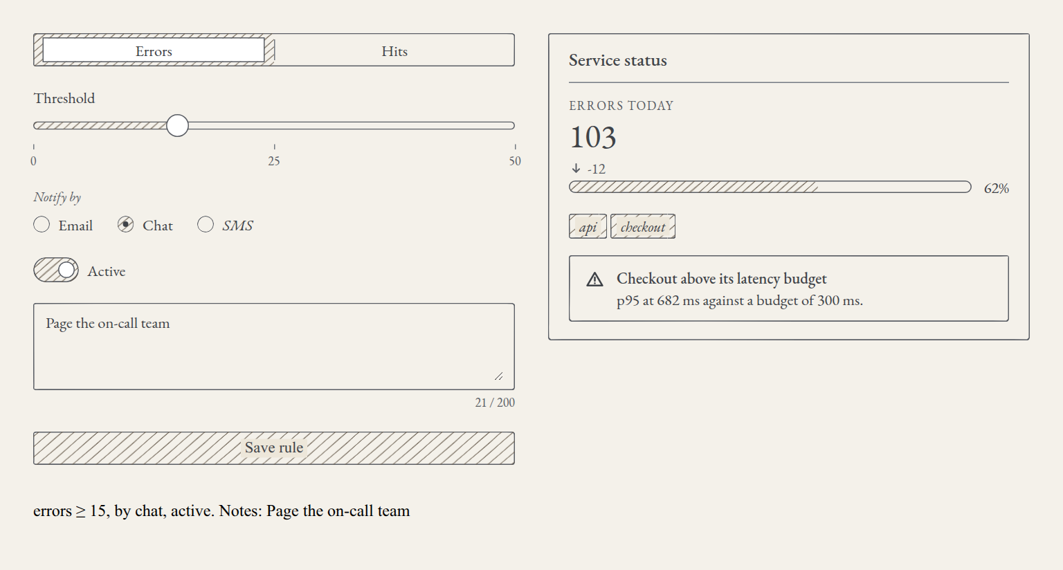
The form chooses the metric, the threshold, the notification channel and whether the rule is active, and keeps some notes. When it is submitted, a status line sums up the rule. The card shows the day's errors, the share of the error budget used, the affected services and an alert.
The components' stylesheet
The components need a third stylesheet, @silverpoint/grounds/ui.css, after styles.css. In React, in src/main.tsx:
import { StrictMode } from 'react';
import { createRoot } from 'react-dom/client';
import '@silverpoint/fonts/fonts.css';
import '@silverpoint/grounds/styles.css';
import '@silverpoint/grounds/ui.css';
import './index.css';
In Vue, the same in src/main.ts:
import { createApp } from 'vue';
import '@silverpoint/fonts/fonts.css';
import '@silverpoint/grounds/styles.css';
import '@silverpoint/grounds/ui.css';
import './style.css';
In Angular, in src/styles.css:
@import '@silverpoint/fonts/fonts.css';
@import '@silverpoint/grounds/styles.css';
@import '@silverpoint/grounds/ui.css';
In Reflex there is nothing to import: each component loads the sheets it needs.
Without ui.css, the components come out unstyled: the browser's native controls show and the glyphs are drawn as huge black shapes.
The components that take a value
| Component | What for | Its value |
|---|---|---|
SpInput | One line of text | A text |
SpTextarea | Several lines, with a counter | A text |
SpInputNumber | A number with buttons and bounds | A number |
SpCheckbox | Yes or no, with an indeterminate state | A boolean |
SpSwitch | On or off | A boolean |
SpRadioGroup | One option among a few | The option's key |
SpSegmented | One option among a few, as joined segments | The option's key |
SpTabs | Tabs with their panel | The tab's key |
SpSlider | A value on a range | A number |
SpRate | A rating from 1 to 5, with lozenges | A number |
Under each one there is a native control: an <input type="range"> in the slider, native radios in the group and in the segments, a checkbox with role="switch" in the switch. That is why they work with the keyboard like any browser control, and why a plain <form> submits them: each one is submitted under its name.
The value can be handled in two ways, like React's fields:
| Controlled | Uncontrolled | Change | |
|---|---|---|---|
| React | value (checked on the checkbox and the switch) | defaultValue (defaultChecked) | onChange(value): the value, not the event |
| Vue | v-model | no v-model, with default-value | update:modelValue |
| Angular | [(value)], formControlName or ngModel | defaultValue | (valueChange) |
| Reflex | value (checked) and on_change | default_value (default_checked) | on_change receives the value |
Value events only fire when the user changes the control. If you change the value from your code, onChange is not called, so there are no loops. A disabled component or option does not fire them either.
The form in React
The rule has four controlled values and one uncontrolled. The notes are only needed on submit, so they are read from the form with FormData, by their name:
import { useState, type FormEvent } from 'react';
import { SpButton } from '@silverpoint/react/ui/button';
import { SpRadioGroup } from '@silverpoint/react/ui/radio-group';
import { SpSegmented } from '@silverpoint/react/ui/segmented';
import { SpSlider } from '@silverpoint/react/ui/slider';
import { SpSwitch } from '@silverpoint/react/ui/switch';
import { SpTextarea } from '@silverpoint/react/ui/textarea';

const METRICS = [
  { key: 'errors', label: 'Errors' },
  { key: 'hits', label: 'Hits' },
];

const CHANNELS = [
  { key: 'email', label: 'Email' },
  { key: 'chat', label: 'Chat' },
  { key: 'sms', label: 'SMS', disabled: true },
];

export function AlertRuleForm() {
  const [metric, setMetric] = useState('errors');
  const [threshold, setThreshold] = useState(10);
  const [channel, setChannel] = useState('email');
  const [active, setActive] = useState(true);
  const [saved, setSaved] = useState('');

  function save(event: FormEvent<HTMLFormElement>) {
    event.preventDefault();
    const notes = new FormData(event.currentTarget).get('notes');
    setSaved(`${metric} ≥ ${threshold}, by ${channel}, ${active ? 'active' : 'paused'}. Notes: ${notes || '—'}`);
  }

  return (
    <form onSubmit={save}>
      <SpSegmented label="Metric" name="metric" items={METRICS} value={metric} onChange={setMetric} />
      <SpSlider
        label="Threshold"
        name="threshold"
        min={0}
        max={50}
        step={5}
        marks={[0, 25, 50]}
        value={threshold}
        onChange={setThreshold}
      />
      <SpRadioGroup
        label="Notify by"
        name="channel"
        items={CHANNELS}
        orientation="horizontal"
        value={channel}
        onChange={setChannel}
      />
      <SpSwitch label="Active" name="active" checked={active} onChange={setActive} />
      <SpTextarea
        label="Notes"
        placeholder="Notes for the on-call team"
        name="notes"
        rows={2}
        maxLength={200}
        showCount
        defaultValue=""
      />
      <SpButton type="submit" variant="primary">
        Save rule
      </SpButton>
      <p role="status">{saved}</p>
    </form>
  );
}
The options of SpSegmented and SpRadioGroup are rows with key and label, and an option can be disabled: the SMS channel shows, but it cannot be chosen and it is not submitted. The handlers receive the value directly, so setMetric or setThreshold are passed as they are.
In src/index.css, a few rules to stack the fields in a column:
form {
  display: grid;
  gap: 20px;
  align-content: start;
}
The form in Vue
v-model on each controlled component, and default-value on the notes:
<script setup lang="ts">
import { ref } from 'vue';
import { SpButton } from '@silverpoint/vue/ui/button';
import { SpRadioGroup } from '@silverpoint/vue/ui/radio-group';
import { SpSegmented } from '@silverpoint/vue/ui/segmented';
import { SpSlider } from '@silverpoint/vue/ui/slider';
import { SpSwitch } from '@silverpoint/vue/ui/switch';
import { SpTextarea } from '@silverpoint/vue/ui/textarea';

const METRICS = [
  { key: 'errors', label: 'Errors' },
  { key: 'hits', label: 'Hits' },
];

const CHANNELS = [
  { key: 'email', label: 'Email' },
  { key: 'chat', label: 'Chat' },
  { key: 'sms', label: 'SMS', disabled: true },
];

const metric = ref('errors');
const threshold = ref(10);
const channel = ref('email');
const active = ref(true);
const saved = ref('');

function save(event: Event) {
  const notes = new FormData(event.currentTarget as HTMLFormElement).get('notes');
  saved.value = `${metric.value} ≥ ${threshold.value}, by ${channel.value}, ${active.value ? 'active' : 'paused'}. Notes: ${notes || '—'}`;
}
</script>

<template>
  <form @submit.prevent="save">
    <SpSegmented label="Metric" name="metric" :items="METRICS" v-model="metric" />
    <SpSlider
      label="Threshold"
      name="threshold"
      :min="0"
      :max="50"
      :step="5"
      :marks="[0, 25, 50]"
      v-model="threshold"
    />
    <SpRadioGroup
      label="Notify by"
      name="channel"
      :items="CHANNELS"
      orientation="horizontal"
      v-model="channel"
    />
    <SpSwitch label="Active" name="active" v-model="active" />
    <SpTextarea
      label="Notes"
      placeholder="Notes for the on-call team"
      name="notes"
      :rows="2"
      :max-length="200"
      show-count
      default-value=""
    />
    <SpButton type="submit" variant="primary">Save rule</SpButton>
    <p role="status">{{ saved }}</p>
  </form>
</template>
Props carry a colon when they receive an expression (:items, :min, :max-length), as in the rest of the series.
The form in Angular
Angular's value components implement ControlValueAccessor, so they work with reactive forms with no adapters. Here the rule is a FormGroup and each component binds to its control with formControlName:
import { Component, signal } from '@angular/core';
import { FormControl, FormGroup, ReactiveFormsModule } from '@angular/forms';
import { SpButton } from '@silverpoint/angular/ui/button';
import { SpRadioGroup } from '@silverpoint/angular/ui/radio-group';
import { SpSegmented } from '@silverpoint/angular/ui/segmented';
import { SpSlider } from '@silverpoint/angular/ui/slider';
import { SpSwitch } from '@silverpoint/angular/ui/switch';
import { SpTextarea } from '@silverpoint/angular/ui/textarea';

const METRICS = [
  { key: 'errors', label: 'Errors' },
  { key: 'hits', label: 'Hits' },
];

const CHANNELS = [
  { key: 'email', label: 'Email' },
  { key: 'chat', label: 'Chat' },
  { key: 'sms', label: 'SMS', disabled: true },
];

@Component({
  selector: 'app-alert-rule-form',
  imports: [ReactiveFormsModule, SpButton, SpRadioGroup, SpSegmented, SpSlider, SpSwitch, SpTextarea],
  template: `
    <form [formGroup]="rule" (ngSubmit)="save()">
      <sp-segmented label="Metric" name="metric" [items]="metrics" formControlName="metric" />
      <sp-slider
        label="Threshold"
        name="threshold"
        [min]="0"
        [max]="50"
        [step]="5"
        [marks]="[0, 25, 50]"
        formControlName="threshold"
      />
      <sp-radio-group
        label="Notify by"
        name="channel"
        [items]="channels"
        orientation="horizontal"
        formControlName="channel"
      />
      <sp-switch label="Active" name="active" formControlName="active" />
      <sp-textarea
        label="Notes"
        placeholder="Notes for the on-call team"
        name="notes"
        [rows]="2"
        [maxLength]="200"
        showCount
        formControlName="notes"
      />
      <button type="submit" spButton variant="primary">Save rule</button>
      <p role="status">{{ saved() }}</p>
    </form>
  `,
})
export class AlertRuleForm {
  protected readonly metrics = METRICS;
  protected readonly channels = CHANNELS;
  protected readonly rule = new FormGroup({
    metric: new FormControl('errors', { nonNullable: true }),
    threshold: new FormControl(10, { nonNullable: true }),
    channel: new FormControl('email', { nonNullable: true }),
    active: new FormControl(true, { nonNullable: true }),
    notes: new FormControl('', { nonNullable: true }),
  });
  protected readonly saved = signal('');

  protected save() {
    const { metric, threshold, channel, active, notes } = this.rule.getRawValue();
    this.saved.set(`${metric} ≥ ${threshold}, by ${channel}, ${active ? 'active' : 'paused'}. Notes: ${notes || '—'}`);
  }
}
In Angular the button is not a component of its own: it is the spButton directive on a native <button>, which is still the control. If you would rather not use forms, each component accepts [(value)] with a signal.
The form in Reflex
In Reflex the value lives in the state, and each controlled component receives value and its on_change handler. The notes use default_value, and on_submit receives the form as a dictionary with the fields by their name:
import reflex as rx
from reflex_silverpoint_react import (
    sp_alert,
    sp_button,
    sp_card,
    sp_progress,
    sp_radio_group,
    sp_segmented,
    sp_slider,
    sp_statistic,
    sp_switch,
    sp_tag,
    sp_textarea,
)

METRICS = [
    {"key": "errors", "label": "Errors"},
    {"key": "hits", "label": "Hits"},
]

CHANNELS = [
    {"key": "email", "label": "Email"},
    {"key": "chat", "label": "Chat"},
    {"key": "sms", "label": "SMS", "disabled": True},
]


class RuleState(rx.State):
    metric: str = "errors"
    threshold: int = 10
    channel: str = "email"
    active: bool = True
    saved: str = ""

    @rx.event
    def set_metric(self, value: str):
        self.metric = value

    @rx.event
    def set_threshold(self, value: float):
        self.threshold = int(value)

    @rx.event
    def set_channel(self, value: str):
        self.channel = value

    @rx.event
    def set_active(self, value: bool):
        self.active = value

    @rx.event
    def save(self, form: dict):
        state = "active" if self.active else "paused"
        notes = form.get("notes") or "—"
        self.saved = f"{self.metric} ≥ {self.threshold}, by {self.channel}, {state}. Notes: {notes}"


def alert_rule_form() -> rx.Component:
    return rx.el.form(
        sp_segmented(
            label="Metric",
            name="metric",
            items=METRICS,
            value=RuleState.metric,
            on_change=RuleState.set_metric,
        ),
        sp_slider(
            label="Threshold",
            name="threshold",
            min=0,
            max=50,
            step=5,
            marks=[0, 25, 50],
            value=RuleState.threshold,
            on_change=RuleState.set_threshold,
        ),
        sp_radio_group(
            label="Notify by",
            name="channel",
            items=CHANNELS,
            orientation="horizontal",
            value=RuleState.channel,
            on_change=RuleState.set_channel,
        ),
        sp_switch(
            label="Active",
            name="active",
            checked=RuleState.active,
            on_change=RuleState.set_active,
        ),
        sp_textarea(
            label="Notes",
            placeholder="Notes for the on-call team",
            name="notes",
            rows=2,
            max_length=200,
            show_count=True,
            default_value="",
        ),
        sp_button("Save rule", type="submit", variant="primary"),
        rx.el.p(RuleState.saved, role="status"),
        on_submit=RuleState.save,
        style={"display": "grid", "gap": "20px", "align_content": "start"},
    )
Each change of a controlled component travels to the backend and back. If the user presses the slider's arrow twice faster than that trip, the second press starts from the previous value. In the test, two presses in a row left the threshold at 15 instead of 20; with a pause between them, at 20. For a field you only need on submit, use default_value and read it in on_submit, like the notes.
The components that show data
| Component | Shows |
|---|---|
SpCard | A frame with a title, a slot on the right and a footer |
SpStatistic | A figure with a title, prefix, suffix and trend |
SpProgress | Progress as a line or a circle, or indeterminate |
SpTag | A short label, which can be closed |
SpBadge | A number or a dot over its content |
SpAlert | An information, success, warning or error message |
SpSteps | The steps of a process and the current one |
SpSkeleton | The placeholder of content that is loading |
SpDivider | A separating rule, with optional text |
The service status card uses five. In React:
import { SpAlert } from '@silverpoint/react/ui/alert';
import { SpCard } from '@silverpoint/react/ui/card';
import { SpProgress } from '@silverpoint/react/ui/progress';
import { SpStatistic } from '@silverpoint/react/ui/statistic';
import { SpTag } from '@silverpoint/react/ui/tag';

export function ServiceStatus() {
  return (
    <SpCard title="Service status">
      <SpStatistic title="Errors today" value={103} trend="down" delta="-12" />
      <SpProgress label="Error budget used" value={62} />
      <p>
        <SpTag>api</SpTag> <SpTag tone={2}>checkout</SpTag>
      </p>
      <SpAlert kind="warning" title="Checkout above its latency budget">
        p95 at 682 ms against a budget of 300 ms.
      </SpAlert>
    </SpCard>
  );
}
In Vue:
<script setup lang="ts">
import { SpAlert } from '@silverpoint/vue/ui/alert';
import { SpCard } from '@silverpoint/vue/ui/card';
import { SpProgress } from '@silverpoint/vue/ui/progress';
import { SpStatistic } from '@silverpoint/vue/ui/statistic';
import { SpTag } from '@silverpoint/vue/ui/tag';
</script>

<template>
  <SpCard title="Service status">
    <SpStatistic title="Errors today" :value="103" trend="down" delta="-12" />
    <SpProgress label="Error budget used" :value="62" />
    <p>
      <SpTag>api</SpTag> <SpTag :tone="2">checkout</SpTag>
    </p>
    <SpAlert kind="warning" title="Checkout above its latency budget">
      p95 at 682 ms against a budget of 300 ms.
    </SpAlert>
  </SpCard>
</template>
In Angular:
import { Component } from '@angular/core';
import { SpAlert } from '@silverpoint/angular/ui/alert';
import { SpCard } from '@silverpoint/angular/ui/card';
import { SpProgress } from '@silverpoint/angular/ui/progress';
import { SpStatistic } from '@silverpoint/angular/ui/statistic';
import { SpTag } from '@silverpoint/angular/ui/tag';

@Component({
  selector: 'app-service-status',
  imports: [SpAlert, SpCard, SpProgress, SpStatistic, SpTag],
  template: `
    <sp-card title="Service status">
      <sp-statistic title="Errors today" [value]="103" trend="down" delta="-12" />
      <sp-progress label="Error budget used" [value]="62" />
      <p>
        <sp-tag>api</sp-tag> <sp-tag [tone]="2">checkout</sp-tag>
      </p>
      <sp-alert kind="warning" title="Checkout above its latency budget">
        p95 at 682 ms against a budget of 300 ms.
      </sp-alert>
    </sp-card>
  `,
})
export class ServiceStatus {}
And in Reflex:
def service_status() -> rx.Component:
    return sp_card(
        sp_statistic(title="Errors today", value=103, trend="down", delta="-12"),
        sp_progress(label="Error budget used", value=62),
        rx.el.p(sp_tag("api"), " ", sp_tag("checkout", tone=2)),
        sp_alert(
            "p95 at 682 ms against a budget of 300 ms.",
            kind="warning",
            title="Checkout above its latency budget",
        ),
        title="Service status",
    )
SpStatistic prints the value as given, without formatting it. The down trend draws the ↓ arrow next to delta, and the warning alert draws its triangle. The card's text (p95 at 682 ms) is the 95th percentile of Checkout from article 14.
Accessibility
- Every control has a name. On the controls with visible text (
SpCheckbox,SpSwitch,SpSlider,SpRadioGroup,SpSegmented,SpProgress),labelis required: in TypeScript, anSpSwitchwithoutlabeldoes not compile. OnSpInputandSpTextarea,labelis the accessible name and is not drawn; if you want a visible caption, use your own<label for>. - A button or a badge without text warns. An
SpButtonwithout text orlabelstill renders, but in development the console showsSP018. - Focus always looks the same. The focus ring is an exact outline, never hand-inked, in the colour of the palette's
focusfield, which is the ink by default. Article 12 explains how to change it. - No state is told by hatching alone. Checked, selected, error or disabled also carry a glyph, a shape, a text or a native state: the trend's arrow, the alert's triangle, the ⚠ of an invalid field.
Common problems
- The components come out with native controls and giant black glyphs.
@silverpoint/grounds/ui.cssis missing. onChangeis not called when the value changes from code. That is expected: value events only answer the user.- In Reflex, the slider skips values with the keyboard. It is the round trip to the backend of a controlled component. Use
default_valueif the value is only needed on submit. - The console shows
SP018. A button or a badge has no text and nolabel.
What comes next
The panel can now ask for data and show its status. Article 17 goes on with the UI components: an incidents table that sorts and pages, a modal to acknowledge an incident and a notification that confirms it.
The components guide in the documentation has the reference of all 38.