Article 09 gave the whole application a common style with the provider: the ground, the substrate and the language of the numbers. This one deals with the provider's fifth field, palette: the colours.
It is an article of level 2 of the series on silverpoint. It explains what a palette is, how to use the six the library brings, how to check the contrast of one of your own and how to switch theme with a selector, without redrawing the data.
What a palette is
silverpoint writes no colour into the drawing. Every stroke and every fill is painted by CSS, through --sp-* custom properties. A palette is an object that gives those properties their values, and the chart writes them on its root's style.
| Field | CSS property | What it paints |
|---|---|---|
substrate | --sp-substrate | The paper the drawing sits on |
ink | --sp-ink | The main series and the frames of the components |
inkSecondary | --sp-ink-secondary | The second series and the hatching |
heighten | --sp-heighten | The white heightening of the live value |
rule | --sp-rule | Rules and baselines |
grid | --sp-grid | The grid |
text | --sp-text | Large figures and primary labels |
textMuted | --sp-text-muted | Axis labels and secondary text |
focus | --sp-ui-focus-color | The focus ring of the components; ink by default |
Every field is optional. The ones you do not declare keep the ground's colour.
A palette has two inks, ink and inkSecondary, and not one colour per series. It is a design decision: in the silverpoint ground, categories differ by hatch density, not by colour.
The six palettes
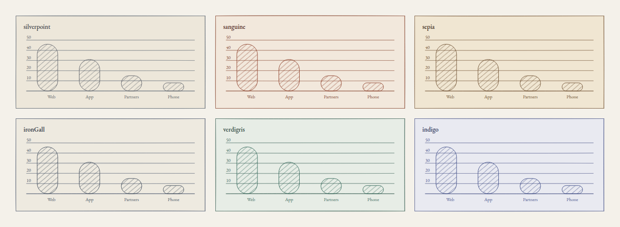
The library brings six palettes named after drawing media, all checked against their own substrate.
| Palette | In Reflex | Substrate | Ink |
|---|---|---|---|
silverpoint | "silverpoint" | #EDE7DA | #5A5E65 |
sanguine | "sanguine" | #F2E8DC | #8A3A24 |
sepia | "sepia" | #F0E6D2 | #6B4C2C |
ironGall | "iron_gall" | #EEEAE0 | #3C4858 |
verdigris | "verdigris" | #E7EDE6 | #2C6355 |
indigo | "indigo" | #E9EAF1 | #3A4884 |
This is the panel's sales-by-channel chart with each one:
Using a palette
In React, Vue and Angular, a palette is an object imported from @silverpoint/core/palettes. You pass the object, never its name: that way, an application that names no palette ships none. Since your code imports from the engine, declare it in your project:
npm install @silverpoint/coreIn Reflex there is nothing to import: palette accepts the palette's name as text.
| Framework | A chart with the sanguine palette |
|---|---|
| React | palette={sanguine} |
| Vue | :palette="sanguine" |
| Angular | [palette]="sanguine", with sanguine as a field of the component |
| Reflex | palette="sanguine" |
The palette can go on a chart, on a dashboard or on the provider. Like the other fields of article 09, it merges field by field: what the chart declares wins over the provider, and what it does not declare it inherits.
A palette of your own
A palette of your own is an object with the fields you want to change, for example your brand's colours. Before using it, check its contrast. checkPalette measures the same pairs the library demands of its own palettes: each ink and each text against the substrate (4.5:1), the rules, the grid and the focus ring (3:1), and the white heightening against its outline.
import { checkPalette } from '@silverpoint/core/palettes';

const brand = {
  substrate: '#F7F3EA',
  ink: '#1F4E79',
  inkSecondary: '#7A5C3E',
  text: '#1B2B3A',
  textMuted: '#9AA8B5',
};

console.log(checkPalette(brand));
The result is a list with one finding per pair below its threshold:
[
  {
    pair: 'text-muted',
    foreground: '#9AA8B5',
    background: '#F7F3EA',
    ratio: 2.19,
    threshold: 4.5
  }
]
The bluish grey of the secondary labels stays at 2.19:1. With textMuted: '#4F6275' the list comes out empty.
In Python it is the same check, with the fields in snake_case:
from reflex_silverpoint_react import Palette, check_palette

BRAND = Palette(
    substrate="#F7F3EA",
    ink="#1F4E79",
    ink_secondary="#7A5C3E",
    text="#1B2B3A",
    text_muted="#9AA8B5",
)

print(check_palette(BRAND))
['text-muted #9AA8B5 on #F7F3EA: 2.19:1, below 4.5:1']If you use the palette without fixing it, the chart draws it as given, but in development the console warns:
[SP023] Palette: a palette colour is below its contrast threshold against its substrate; it is drawn as given (`text-muted`). #9AA8B5 on #F7F3EA is 2.19:1, below 4.5:1. Recompute the palette with checkPalette(); colours are not chosen by eye. (REQ-466)A value that is not a safe colour, such as '#2C6355; display: none', is not drawn: the field is dropped and the console shows SP024. In Reflex, a field that does not exist or an unknown palette name fail earlier, when the page is built, with a ValueError that lists the valid names.
Switching theme
A theme is a ground and a palette. The panel from article 09 will get a selector with four: three palettes on silverpoint and the cyanotype, which needs no palette. In React, Vue and Angular, the themes go in themes.ts:
import type { GroundName, Palette } from '@silverpoint/core';
import { indigo, sanguine, silverpoint } from '@silverpoint/core/palettes';

export type Theme = {
  key: string;
  label: string;
  ground: GroundName;
  palette?: Palette;
};

export const themes: Theme[] = [
  { key: 'silverpoint', label: 'Silverpoint', ground: 'silverpoint', palette: silverpoint },
  { key: 'sanguine', label: 'Sanguine', ground: 'silverpoint', palette: sanguine },
  { key: 'indigo', label: 'Indigo', ground: 'silverpoint', palette: indigo },
  { key: 'cyanotype', label: 'Cyanotype', ground: 'cyanotype' },
];
React
The chosen theme is component state, and the provider receives it as props:
import { useState } from 'react';
import { SilverpointProvider } from '@silverpoint/react';
import { Panel } from './Panel';
import { themes } from './themes';

export default function App() {
  const [key, setKey] = useState('silverpoint');
  const theme = themes.find((t) => t.key === key) ?? themes[0];

  return (
    <main style={{ maxWidth: 640 }}>
      <label>
        Theme{' '}
        <select value={key} onChange={(event) => setKey(event.target.value)}>
          {themes.map((t) => (
            <option key={t.key} value={t.key}>
              {t.label}
            </option>
          ))}
        </select>
      </label>
      <SilverpointProvider ground={theme.ground} palette={theme.palette}>
        <Panel />
      </SilverpointProvider>
    </main>
  );
}
Panel is the one from article 09, unchanged.
Vue
SilverpointProvider follows its props like any Vue component:
<script setup lang="ts">
import { computed, ref } from 'vue';
import { SilverpointProvider } from '@silverpoint/vue';
import Panel from './Panel.vue';
import { themes } from './themes';

const key = ref('silverpoint');
const theme = computed(() => themes.find((t) => t.key === key.value) ?? themes[0]);
</script>

<template>
  <main style="max-width: 640px">
    <label>
      Theme
      <select v-model="key">
        <option v-for="t in themes" :key="t.key" :value="t.key">{{ t.label }}</option>
      </select>
    </label>
    <SilverpointProvider :ground="theme.ground" :palette="theme.palette">
      <Panel />
    </SilverpointProvider>
  </main>
</template>
Angular
In Angular, provideSilverpoint receives a fixed object when the injector is created, so it does not work for a theme that changes. The theme goes to the charts' inputs, which do follow signals. The panel receives the ground and the palette as inputs, src/app/panel.ts:
import { Component, input } from '@angular/core';
import type { GroundName, Palette } from '@silverpoint/core';
import { SpBarChart } from '@silverpoint/angular/bar-chart';
import { SpLineChart } from '@silverpoint/angular/line-chart';
import { sales } from './sales';
import { traffic } from './traffic';

@Component({
  selector: 'app-panel',
  imports: [SpLineChart, SpBarChart],
  template: `
    <section style="display: grid; gap: 16px">
      <sp-line-chart
        [data]="traffic"
        xKey="hour"
        valueKey="hits"
        title="Hits per hour"
        [value]="63844"
        unit="requests at the peak"
        [ground]="ground()"
        [palette]="palette()"
      />
      <sp-bar-chart
        [data]="sales"
        xKey="channel"
        valueKey="sales"
        title="Sales by channel"
        [ground]="ground()"
        [palette]="palette()"
      />
    </section>
  `,
})
export class Panel {
  readonly ground = input<GroundName>();
  readonly palette = input<Palette>();
  protected readonly traffic = traffic;
  protected readonly sales = sales;
}
And src/app/app.ts keeps the theme in a signal:
import { Component, computed, signal } from '@angular/core';
import { Panel } from './panel';
import { themes } from './themes';

@Component({
  selector: 'app-root',
  imports: [Panel],
  template: `
    <main style="max-width: 640px">
      <label>
        Theme
        <select #select (change)="key.set(select.value)">
          @for (t of themes; track t.key) {
            <option [value]="t.key" [selected]="t.key === key()">{{ t.label }}</option>
          }
        </select>
      </label>
      <app-panel [ground]="theme().ground" [palette]="theme().palette" />
    </main>
  `,
})
export class App {
  protected readonly themes = themes;
  protected readonly key = signal('silverpoint');
  protected readonly theme = computed(() => themes.find((t) => t.key === this.key()) ?? themes[0]);
}
Reflex
In Reflex, the theme is state. The provider's palette is a computed var with the fields of the chosen palette, as a dictionary:
import reflex as rx
from reflex_silverpoint_react import PALETTES, bar_chart, line_chart, silverpoint_provider

from .sales import SALES
from .traffic import TRAFFIC

THEMES = {
    "silverpoint": {"label": "Silverpoint", "ground": "silverpoint", "palette": "silverpoint"},
    "sanguine": {"label": "Sanguine", "ground": "silverpoint", "palette": "sanguine"},
    "indigo": {"label": "Indigo", "ground": "silverpoint", "palette": "indigo"},
    "cyanotype": {"label": "Cyanotype", "ground": "cyanotype", "palette": None},
}


class ThemeState(rx.State):
    theme: str = "silverpoint"

    @rx.event
    def set_theme(self, value: str):
        self.theme = value

    @rx.var
    def ground(self) -> str:
        return THEMES[self.theme]["ground"]

    @rx.var
    def palette(self) -> dict[str, str]:
        name = THEMES[self.theme]["palette"]
        return PALETTES[name].to_dict() if name else {}


def panel() -> rx.Component:
    return rx.el.section(
        line_chart(
            data=TRAFFIC,
            x_key="hour",
            value_key="hits",
            title="Hits per hour",
            value=63844,
            unit="requests at the peak",
        ),
        bar_chart(data=SALES, x_key="channel", value_key="sales", title="Sales by channel"),
        style={"display": "grid", "gap": "16px"},
    )


def index() -> rx.Component:
    return rx.el.main(
        rx.el.label(
            "Theme ",
            rx.el.select(
                *[rx.el.option(theme["label"], value=key) for key, theme in THEMES.items()],
                value=ThemeState.theme,
                on_change=ThemeState.set_theme,
            ),
        ),
        silverpoint_provider(panel(), ground=ThemeState.ground, palette=ThemeState.palette),
        style={"max_width": "640px", "padding": "32px"},
    )


app = rx.App()
app.add_page(index)
For the cyanotype, the palette is an empty dictionary: no field declared, so the ground's colours are used.
What gets redrawn
Changing palette does not redraw the chart. Only the values of the --sp-* properties on each chart's root change; the SVG paths are the same, character for character. I checked it in the four frameworks going from silverpoint to sanguine and to indigo.
Changing ground does redraw, because the cyanotype builds tone another way: without hatching, with the weight of the line. When you go back to silverpoint, the chart draws exactly the same lines as before, because the hand stroke comes from the seed, not from chance.
Common problems
- TypeScript rejects
palette="sanguine". In React, Vue and Angular,palettereceives the object imported from@silverpoint/core/palettes, not its name. The name only works in Reflex. - The console shows
SP023and the chart looks fine. One of the colours does not reach the minimum contrast against the substrate. It is drawn anyway, but someone with low vision may not read it. Fix it withcheckPalette. - A colour of the palette does not appear. If in development the console shows
SP024, the value is not a safe colour or the field does not exist, and it was dropped. - The page background does not change with the theme. The palette only paints silverpoint's elements. For your own elements,
paletteStylein JavaScript andpalette_cssin Python return the same--sp-*properties.
What comes next
You now have the panel with a theme the user chooses. Article 13 arranges it in a responsive grid with the Dashboard component, which also accepts a ground, a substrate and a palette for every chart it holds.
The palettes documentation has the six palettes and the contrast check.