The operations panel of the series on silverpoint already has charts, a dashboard, components and a timeline. It still has to be presented at the Monday meeting. This last article of level 3 builds the weekly operations review as a presentation written in Markdown, with the panel's charts inside.
The syntax is Marp's: slides separated by ---, directives in HTML comments. silverpoint adds one kind of code block, silverpoint, which becomes a live chart: with its tooltip, its accessible table and the ground's inking.
What you will build
A four-slide presentation: the cover, the traffic per hour as a line chart, a list of what happened during the week and the sales by channel as a donut chart, the last one in cyanotype. Below it, a line of text says which slide you are on.
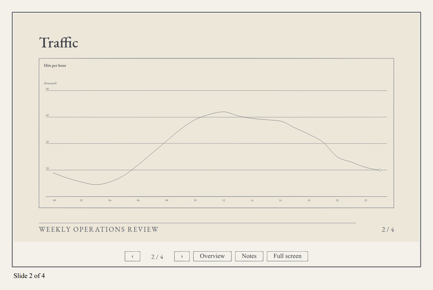
The keyboard arrows move through the slides, and the page address keeps the current slide, as #2.
What you need
Your framework's project from articles 03 to 06. The charts' data goes inside the Markdown, so the hits file is not needed.
1. Install @silverpoint/marp
The presentation engine lives in its own package, @silverpoint/marp, which brings Marpit, Marp's core. It is an optional peer of the adapters. In React, Vue and Angular:
npm install @silverpoint/marp@^0.10.1Reflex does not need this: sp_deck installs it and adds its stylesheets.
2. The stylesheets
Four, in this order: the fonts, the ground, the UI components and the presentations' one, @silverpoint/marp/deck.css.
In React, in src/main.tsx:
import { StrictMode } from 'react';
import { createRoot } from 'react-dom/client';
import '@silverpoint/fonts/fonts.css';
import '@silverpoint/grounds/styles.css';
import '@silverpoint/grounds/ui.css';
import '@silverpoint/marp/deck.css';
import './index.css';
import App from './App.tsx';

createRoot(document.getElementById('root')!).render(
  <StrictMode>
    <App />
  </StrictMode>,
);
In Vue, in src/main.ts:
import { createApp } from 'vue';
import '@silverpoint/fonts/fonts.css';
import '@silverpoint/grounds/styles.css';
import '@silverpoint/grounds/ui.css';
import '@silverpoint/marp/deck.css';
import './style.css';
import App from './App.vue';

createApp(App).mount('#app');
In Angular, in src/styles.css:
@import '@silverpoint/fonts/fonts.css';
@import '@silverpoint/grounds/styles.css';
@import '@silverpoint/grounds/ui.css';
@import '@silverpoint/marp/deck.css';

body {
  margin: 0;
  padding: 32px;
  background: #f4f1ea;
}
3. The presentation in Markdown
Create src/review.md in React and Vue, src/app/review.md in Angular or ops_panel/review.md in Reflex. It is the same file in all four:
---
paginate: true
footer: Weekly operations review
---

<!-- _class: lead -->

# Weekly operations review

The web service, week 45.

---

## Traffic

```silverpoint
{
  "chart": "line-chart",
  "data": [
    {"hour": "00", "hits": 18},
    {"hour": "01", "hits": 14},
    {"hour": "02", "hits": 11},
    {"hour": "03", "hits": 9},
    {"hour": "04", "hits": 11},
    {"hour": "05", "hits": 16},
    {"hour": "06", "hits": 24},
    {"hour": "07", "hits": 33},
    {"hour": "08", "hits": 42},
    {"hour": "09", "hits": 51},
    {"hour": "10", "hits": 58},
    {"hour": "11", "hits": 62},
    {"hour": "12", "hits": 64},
    {"hour": "13", "hits": 61},
    {"hour": "14", "hits": 59},
    {"hour": "15", "hits": 58},
    {"hour": "16", "hits": 57},
    {"hour": "17", "hits": 52},
    {"hour": "18", "hits": 47},
    {"hour": "19", "hits": 41},
    {"hour": "20", "hits": 30},
    {"hour": "21", "hits": 26},
    {"hour": "22", "hits": 22},
    {"hour": "23", "hits": 20}
  ],
  "props": {"xKey": "hour", "valueKey": "hits", "title": "Hits per hour", "unit": "thousands"},
  "height": 360
}
```

---

## What happened

* Release 2.2 put a CDN in front of the API
* Errors peaked at 12:00, with 11 in the hour
* Search stayed under its latency budget

<!-- Pause on the CDN: it explains the lower p95. -->

---

<!-- _ground: cyanotype -->

## Sales by channel

```silverpoint
{
  "chart": "donut-chart",
  "data": [
    {"channel": "Web", "sales": 46},
    {"channel": "App", "sales": 31},
    {"channel": "Partners", "sales": 15},
    {"channel": "Phone", "sales": 8}
  ],
  "props": {"nameKey": "channel", "valueKey": "sales", "title": "Sales by channel", "centerLabel": "thousand EUR"},
  "height": 360
}
```
What is in it:
| Element | What it does |
|---|---|
The opening block between --- | The global directives: paginate numbers the slides and footer puts the footer on all of them |
--- | Separates two slides |
<!-- _class: lead --> | A single-slide directive: the underscore limits it to that slide. lead centres the cover |
A silverpoint code block | A live chart: a JSON object with the chart, its rows and its props |
<!-- Pause on the CDN… --> | A comment that is not a directive is a speaker note |
<!-- _ground: cyanotype --> | Changes the ground on that slide only |
The directives
silverpoint adds three directives to Marpit's: ground, substrate and mode, with their single-slide forms, _ground, _substrate and _mode. Marpit's also work: theme, class, paginate, header, footer, backgroundColor, backgroundImage, color, size, headingDivider and lang.
There are four slide classes: lead, invert, plate and hatched.
The Markdown's HTML is never rendered: comments are read as directives or notes, and the rest of the HTML is ignored.
The chart blocks
| Key | What it is |
|---|---|
chart | The chart, by its name in the catalog: line-chart, donut-chart… |
data | The rows |
props | The chart's props, with their React names: xKey, valueKey, nameKey… |
width, height | The size; the height is 360 by default |
id | The chart's identifier; by default, the presentation's, the slide's and the chart's order |
ground, substrate, mode, palette | That chart's style; if you leave them out, it inherits its slide's |
The fragments
Each list item is a fragment. When you reach the What happened slide, the list is hidden, and each press of the arrow shows one item. With all three in view, the next press moves to the next slide.
4. In React
Vite loads the Markdown as text with the ?raw suffix:
import { useState } from 'react';
import { SpDeck } from '@silverpoint/react/deck';
import markdown from './review.md?raw';

export default function App() {
  const [page, setPage] = useState(1);
  const [total, setTotal] = useState(0);

  return (
    <main style={{ maxWidth: 960 }}>
      <SpDeck
        markdown={markdown}
        page={page}
        onPageChange={(change) => {
          setPage(change.page);
          setTotal(change.total);
        }}
        onReady={(ready) => setTotal(ready.total)}
        hash={true}
      />
      <p>
        Slide {page} of {total}
      </p>
    </main>
  );
}
page and onPageChange make the page a controlled state: the component reports the change and you decide the page. onPageChange receives { page, total }, and onReady receives { total } when the presentation is ready. With hash, the page address carries the slide number.
5. In Vue
<script setup lang="ts">
import { ref } from 'vue';
import { SpDeck } from '@silverpoint/vue/deck';
import markdown from './review.md?raw';

const page = ref(1);
const total = ref(0);

function onReady(ready: { total: number }) {
  total.value = ready.total;
}
</script>

<template>
  <main style="max-width: 960px">
    <SpDeck :markdown="markdown" v-model:page="page" :hash="true" @ready="onReady" />
    <p>Slide {{ page }} of {{ total }}</p>
  </main>
</template>
v-model:page does the same as page and onPageChange in React. The other events are emits: @page-change, @fragment-change and @ready.
6. In Angular
Angular does not load Markdown by default. In angular.json, inside the options of build, tell it to load .md files as text:
"loader": {
  ".md": "text"
},
"allowedCommonJsDependencies": [
  "@marp-team/marpit"
]
allowedCommonJsDependencies silences the warning that Marpit is not an ESM module. For TypeScript to accept the import, create src/markdown.d.ts:
declare module '*.md' {
  const markdown: string;
  export default markdown;
}
And the component, in src/app/app.ts:
import { Component, signal } from '@angular/core';
import { SpDeckComponent } from '@silverpoint/angular/deck';
import markdown from './review.md';

@Component({
  selector: 'app-root',
  imports: [SpDeckComponent],
  template: `
    <main style="max-width: 960px">
      @defer {
        <sp-deck
          [markdown]="markdown"
          [page]="page()"
          (pageChange)="page.set($event.page)"
          (ready)="total.set($event.total)"
          [hash]="true"
        />
      } @placeholder {
        <p>Loading the deck…</p>
      }
      <p>Slide {{ page() }} of {{ total() }}</p>
    </main>
  `,
})
export class App {
  protected readonly markdown = markdown;
  protected readonly page = signal(1);
  protected readonly total = signal(0);
}
(pageChange) receives { page, total }, as in React and Vue. The @defer block is not required, but it is needed with Angular's default budget: without it, the presentation engine goes in the initial bundle, which goes over 1 MB, and the production build fails. With @defer, the initial bundle stays at 420 kB and the presentation loads separately.
7. In Reflex
from pathlib import Path

import reflex as rx
from reflex_silverpoint_react import sp_deck

MARKDOWN = Path(__file__).with_name("review.md").read_text()


class DeckState(rx.State):
    page: int = 1
    total: int = 0

    @rx.event
    def set_page(self, page: int, total: int):
        self.page = page
        self.total = total

    @rx.event
    def set_total(self, total: int):
        self.total = total


def index() -> rx.Component:
    return rx.box(
        sp_deck(
            MARKDOWN,
            page=DeckState.page,
            on_page_change=DeckState.set_page,
            on_ready=DeckState.set_total,
            hash=True,
        ),
        rx.text("Slide ", DeckState.page, " of ", DeckState.total),
        max_width="960px",
        padding="32px",
    )


app = rx.App()
app.add_page(index)
The Markdown is read once, when the module is imported. on_page_change calls the backend with the page and the total, and on_ready with the total. With hash=True, the page also lives in the address, as in the other three.
The keyboard
With focus in the presentation:
| Keys | What they do |
|---|---|
| Right arrow, down arrow, Page Down, Space, Enter | The next step: a fragment or the next slide |
| Left arrow, up arrow, Page Up, Shift + Space | The previous step |
| Home, End | The first and the last slide |
| o | The overview of all the slides |
| f | Full screen |
| n | The speaker notes |
Keys typed into a form field do not move the presentation. On touch screens, a horizontal swipe also moves through the slides.
The events
| Event | What it carries | React | Vue | Angular | Reflex |
|---|---|---|---|---|---|
| Page change | page, total | onPageChange | v-model:page, @page-change | (pageChange) | on_page_change |
| Fragment change | page, step, steps | onFragmentChange | @fragment-change | (fragmentChange) | on_fragment_change |
| Ready | total | onReady | @ready | (ready) | on_ready |
The limits and the warnings
| Code | When |
|---|---|
SP026 | A chart block is invalid: its JSON, its chart, a prop, a size or an error of the chart. The slide shows the error in its place |
SP027 | A directive has an unknown value. The inherited one holds |
SP028 | The page is outside the presentation. It is clamped to the nearest one |
SP029 | The Markdown exceeds a limit: 512 KB, 300 slides or 60 chart blocks. It is rendered up to the limit |
With silverpoint's MCP server connected, the validate_deck tool checks the Markdown before you open it. With a ground that does not exist, _ground: sepia, and a prop the line chart does not declare, colour, it returned two warnings:
SP027: "Slide 2: ground "sepia" is not a registered ground; the inherited value holds."SP026: "Chart fence on slide 2: line-chart does not declare "colour"."
With this article's presentation, it returns none. render_deck returns the presentation as a standalone HTML document.
Marp CLI
The same presentation can be converted without an application, with Marp's command line and silverpoint's engine. The backdrops and the charts come out as static SVG:
npx @marp-team/marp-cli --engine @silverpoint/marp/cli review.md@silverpoint/marp also ships the theme as a stylesheet, @silverpoint/marp/theme.css, for Marp CLI with --theme or for the Marp extension for VS Code. With the theme alone, without the engine, the presentation loses the generated backdrops and the silverpoint blocks show as code.
The size
The presentation engine includes Marpit and its Markdown parser. In React, the build gives an 856 kB bundle, 272 kB compressed, and Vite warns that it is over 500 kB. In Vue, 651 kB, 210 kB compressed. The blocks' charts load separately, each in its own chunk, only if the presentation uses them. If the presentation is not on your application's first page, load it with a dynamic import, as @defer does in Angular.
Common problems
- The build cannot find
@silverpoint/marp. It is not installed: it is an optional peer. - A chart block shows as code. The block is not called
silverpoint, or you are using Marp's theme without silverpoint's engine. - An error appears instead of the chart and the console shows
SP026. The block's JSON is invalid or it has a prop the chart does not declare.validate_decktells you which. - A directive does nothing and the console shows
SP027. Its value does not exist: usesilverpointorcyanotype, one of their substrates, andinkorprecision. - The arrows do not move the slides. Focus is not in the presentation: click on it first.
- The Angular build fails on the budget. Use
@deferor raise the budget inangular.json.
What comes next
With this article, level 3 ends. The panel is now an application: UI components, export, server rendering, live data, a timeline and a presentation.
Level 4 brings everything together in a final project. It starts with article 23: the complete operations panel in React with Next.js.